Feature Artist: Charlotte


As Charlotte is only 11 years old, I think you will agree that this is a most interesting and mature image.
Charlotte and I spoke about the concept she had in her MindStudio before commencing the painting. What amazed me was that when I started to speak about having images in you mind she agreed and described many of the MindPictures she has. With that she announced that she would like to create a seascape.
I gave her a small canvas board which she immediately positioned to a landscape view. And this is important. Once you have in mind what you want to paint you need to decide if it will be a landscape view or a portrait view. The landscape view places the emphasis on the width of the image; the portrait view emphasises the height or depth of the image. I always imagine the View of the painting as comparing the difference between reading a novel (landscape) and short story (portrait). For me the landscape view always implies that there is more of the narrative going on beyond the edges of the painting. A portrait view is often more dramatic, more dynamic. I guess it depends on the subject matter also. We must examine this in a Blog; it’s an interesting question.
>Painting HintDon’t be frightened to alter the view of your painting to achieve a different effect.
Charlotte chose her colours. A Cobalt Blue for the sky; Raw Sienna and Yellow Ochre for the sand. The sea was achieved with a combination of cobalt blue with a little green added. She also had Titanium White to add to the sky, sea and sand and a grey which she used on the sky.
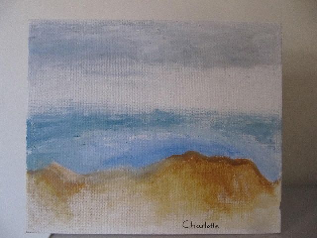
The sea was done in the same way with the small lines which were expanded into blocks of colour. Charlotte deliberately left the space between the sky and the water thus creating the sense of a cloud over the water.
Every stroke was meticulously executed.
Every move was thought through and carried out deliberately.
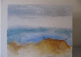
Once Charlotte had the composition correct, she set about adding the subtle colours to achieve the effect she wanted. Notice the patches of white on the water to give light. And the varying colour of the sea.
This is contrasted with the touch of grey in the sky
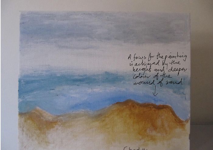
And what is remarkable is that Charlotte knew this effect would be achieved. Also remarkable is that she has not painted in all the canvas. Again leaving the clear patches which contrast with the varying tones of the sand and achieves a sense of depth. And I love the subtle patch of lighter sand on the far left. The patches of blank canvas at the bottom of the painting complement the blank canvas between the sea and the sky.
It was a pleasure to watch her paint and to learn a little more about how children think.